
In our previous article ‘Comics for Education: An engaging teaching and learning approach’, we discussed how comics can be an efficient medium for learning, thanks to providing visual-verbal connections, which is an excellent way to train pupils’ brains and to facilitate writing, reading comprehension, language learning and meaning-making.
What happens in the case of learners who experience learning difficulties or some type of Specific Learning Disorder (SLD)? Are comics also recommended for supporting these learners to improve their skills and learning? How to address comics with ‘dys’ pupils?
There is a general misconception that comics are to light a medium to support actual learning in general. Nevertheless, scientific research supports that since a great part of our brain is devoted to handling visual input, using visual support strategies such as comic strips is effective and can be a great component for success for all students, but especially those who have learning difficulties, or SLDs, or cognitive and behavioural disabilities.
One could argue that not all comics are accessible to learners with SLDs. Yet, we support that if they are conceived in specific ways, it is possible to provide a clear structure and to help these learners understand key notions of a lesson in more visual ways.

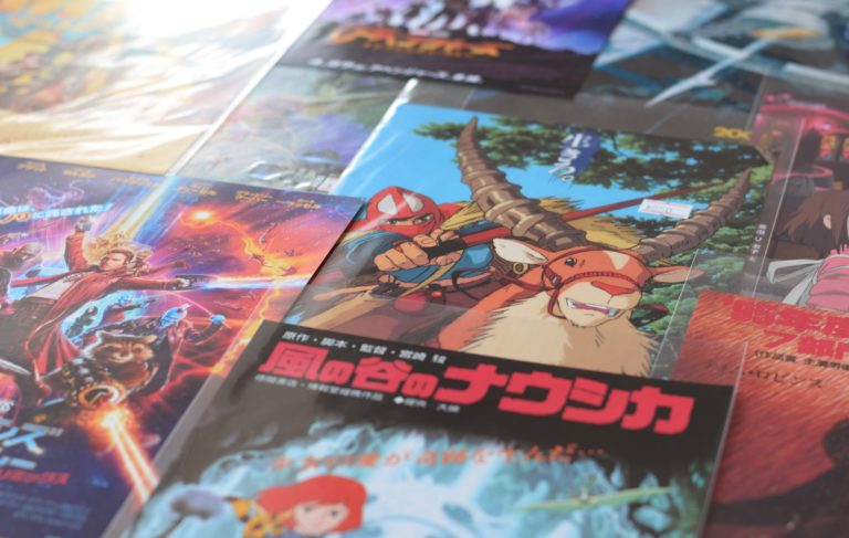
Image by 【微博/微信】愚木混株 cdd20 from Pixabay
Below we list some of the ways to create comics to support SLD readers.
- Adaptations in the text
In general, the use of expressive Sans Serif fonts, writing text all in capitals, and short bits of text makes the visual aspects of reading in comics easier for many dyslexic children and adults. On the other hand, handwritten fonts can be difficult to read, especially for pupils with SLDs. Automatic or digital writing nowadays uses fonts that resemble a handwritten style – as this is the tradition of comic art – but fonts like Comic Sans and Sans Serif types are considered to be dys-friendly (British Dyslexia Association).
Also, an important adaptation is to avoid italics, which are used quite a bit throughout classic comics (applied in dialogues, internal monologues, captions, broadcast balloons etc.). Indeed, italics give the impression that all letters are linked, and it makes it more difficult for students who have trouble reading to make up the letter, and ultimately the word. Instead, the text could be highlighted, in bold or written in a different colour.
- Numbering
For learners with SLD it is better to write the numbers spelled out, unless they are a date, designation, part of a name or a larger number.
- Adaptation of the panels
A panel is the window frame in which the action is depicted, as if it were ‘on-camera’. An adapted comic panel should be large enough, with a clear outline and should read from left to right (for western countries). This will help ‘dys’ readers distinguish the different actions and scenes, allowing an easy navigation through the different panels and through the story. For younger readers, comics can use arrows to show the reading direction from panel to panel.
In the case of Japanese comics (manga), the reading order is from right to left, which can be a bit more challenging to read for learners with SLDs, at least at the beginning.
- Speech bubbles or balloons
Comic bubbles (or balloons) make speech and sound visible to the reader. The text inside a balloon reads in relation to the position of the speaker, and for students with SLDs it is important to use clear balloons tails to indicate which character is speaking by pointing to the character’s mouth.
Comic bubbles can vary in shapes and sizes, if they remain consistent through all the comic book and do not overlap with each other or with the frame of the panels. Also, it is important to have enough space inside the bubbles for the text to fit and to avoid the use of hyphens to break the words on several lines.
- Caption boxes
Text framing in comics includes caption boxes that provide additional information about the story: for example, they can indicate location and time, internal monologue, characters that are off-camera or the narrator’s voice. These captions are usually in the same font as the dialogue but should avoid being written in italics or bold italics as mentioned earlier.
- Graphic design and illustrations
In terms of graphic design and illustrations, a good quality of image including a good quality of printing should be ensured for readers with SLDs. Overloaded graphics and the use of many bright colours should be avoided, but colour contrast (black and white) and a clear outline is always a safe design. Furthermore, attention should be paid to the distance of image and text, which should not be too far away for the reader to be able to understand links easily.
These are a few of the simple adaptations that can be done in comics when creating one, which can be implemented to facilitate SLD readers’ experience by making comics more accessible and inclusive for all. By doing so, comics would not only help students’ development of skills and school learning, but also increase their confidence in their abilities and may even prompt a further interest in reading. As with any teaching resources, the application of comics is limited only by the imagination of the teacher.
Logopsycom, in collaboration with partner organisations in Greece, Cyprus, Romania, France and Spain, work on the Erasmus+ project “EdComix” to spread knowledge about using comics for English language learning in an inclusive way (regarding Specific Learning Disorders but also socio-cultural differences). The project will provide teachers and students with the tools to create their own comic strips and pages for innovative pedagogy.
An Erasmus+ project
Visit the project’s website![]() Follow the project on Facebook : @EdComix
Follow the project on Facebook : @EdComix
In collaboration avec : YuzuPulse, ‘Mihai Bacescu’ Technical College, Areadne, Babel idiomas, Citizens in Power