Despite the Web being conceived as universal and accessible, there are still significant barriers existing today for its unhampered use, especially for certain categories of users, such as those with disabilities. According to figures from the European Dyslexia Association (EDA), there are between 9% and 12% of people with learning disabilities in Europe. These people represent users that require adapted tools and resources to ensure the proper use of digital technology.
When websites and tools are well designed and coded, people with disabilities can navigate through them. However, many sites and tools are currently developed with accessibility barriers that make it difficult or impossible for these categories of users to use them.
In line with the fundamental idea of the 2030 Agenda for Sustainable Development of leaving no one behind, we have sought to ensure that the digital resources of the VISITOR project, the digital library and gaming app, guarantee equitable access to information, education, and personal fulfilment for all interested users and visitors. For this reason, we wanted to facilitate access to the content of these resources to reach as many users as possible.
Therefore, we have applied three design principles to ensure digital inclusivity towards people with learning disorders and other disabilities:
1. Predictable design
Both the appearance and the operability of the online resources must be intuitive and consistentto help users quickly intuit how to navigate the resources and enjoy a smooth browsing experience. Some good practices in the design of the digital library and gaming app that have considered this element for making content and navigation for all users more predictable include:
A constant colour scheme
The logo of our project VISITOR is in dark blue with details in yellow, so we have followed this same aesthetic in our digital library; the main headings are in blue while little details such as navigation buttons are in yellow. We can see this in functions such as when selecting the text and browsing the navigation bar.
The highlighted text coincides with the project logo colours
The navigation bar coincides with the project logo colours
Font consistency
We have designed VISITOR’s digital library in such a way to establish an intuitive visual hierarchy with the font types and colours, so that users can differentiate between the primary and the complementary information. For instance, we have used headings in bold and in a different font type than the explanatory texts.
Text that is of higher importance is shown in bolder and bigger font.
Standard interface patterns and symbols
The navigation mechanisms and icons used in our digital library as well as in the gaming app are familiar to other website designs, such as: having the search bar be represented by a magnifying glass and compulsory data in forms by an asterisk symbol, as well as moving with the use of arrow keys on a standard keyboard for the gaming app, consistent with the gameplay in other online games.
Users can easily recognise the purpose of this bar with the magnifying glass symbol
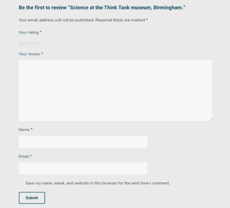
Users can recognise which information is needed to submit their queries
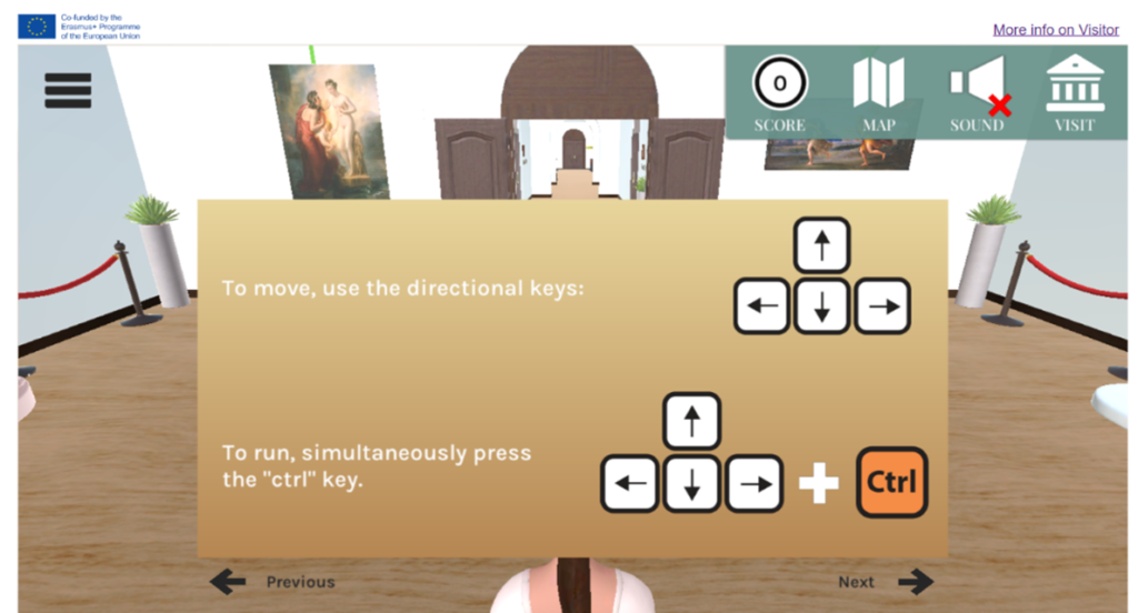
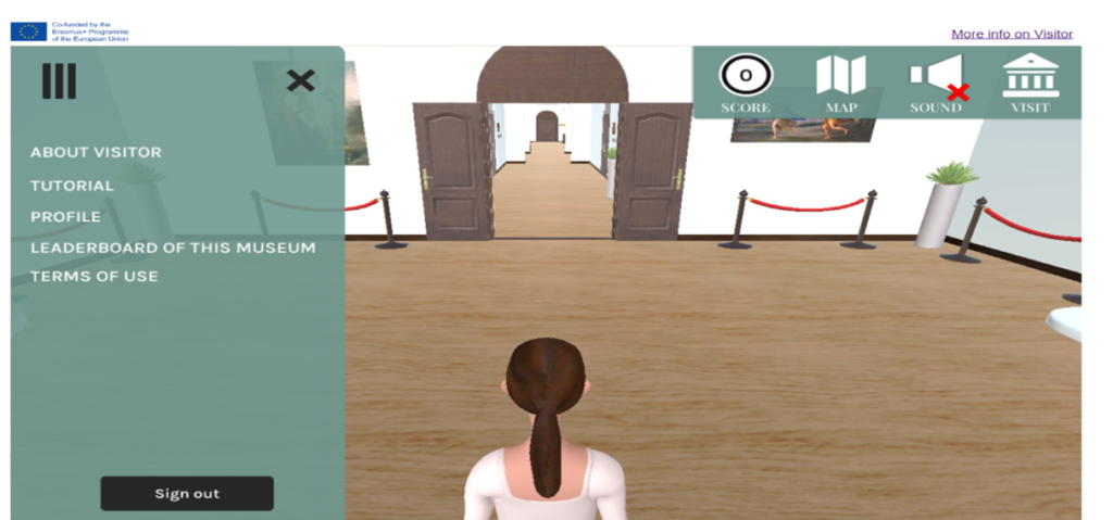
Users move around the virtual space of the gaming app with familiar keyboard keys
Navigational elements and sections are instinctively located
The search bar can be found on the top right, the Home icon on the top left, and the option to change languages is found in the top right of the digital library, crafting an expected interface for users.
Users are met with familiar navigational cues when browsing the digital library
2. Readability of content
This accessible design principle refers to ensuring that both the design and content of the resources is understandable to the user that is reading them (or listening via a screen reader).
In both of our aforementioned online resources we provide a solid structure to ensure that the information contained within is clear and easy to follow. Therefore, we have considered:
Heading structure
Headings serve as guides that help readers quickly scan through the various sections of our resources’ webpages to get an idea of what each entail.
Colour contrast
Contrast is important for accessibility purposes. A good contrast level makes for a good reading experience for all users in general, but we should be mindful to avoid high contrast combinations such as black text on a white background. In our digital library, we use a plain, light colour for the background and a dark grey for the text.
Left-aligned text and bullet points
A consistent left margin makes reading easier.
Bold
Instead of underlining (reserved for links), we use boldto emphasise important information.
Clean typography
Limited variations and diversity of fonts help to maintain a certain harmony in the design. In our case, we have just used two font types, one for the headings and another for the main body text.
Moreover, we also bear in mind the spacing between lines since larger line spacing improves readability (as shown in previous screenshots).
Simple and clear language
Failing to match the reading level of the general public with the content’s text could lose many potentially interested visitors and users. By reducing jargon, shortening sentences, and using plain language, we can improve the user’s perception of our online resources.
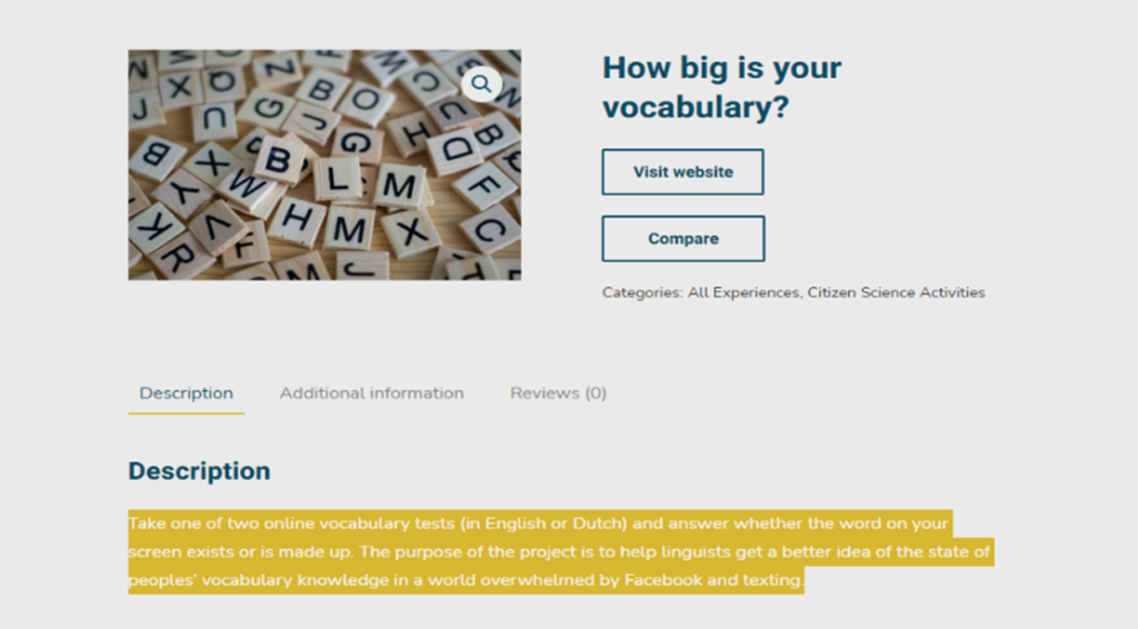
Good readability seen through the listing of items with bulletpoints and use of clear language
Good readability seen through the use of appropriate heading structures and bold to emphasise
3. User-in-mind design
We aim to create a joyful experience for all who navigate our digital resources and to do so, we need to centre our attention to all users’ needs. Thus, we have observed the need to implement the following elements to create as enriching an online experience as possible:
Menu markers
Found below, this design choice serves as a visual indicator that sub-menu options are found within.
Menu markers show users that more options are hidden within the Experiences menu option.
Constant presence of help during gameplay
Since some users may struggle with visual memory, we have provided a retractable menu in our gaming app that is always visible and accessible to inform or remind users about the instructions of the game.
Self-paced game
There is no time limit to answer the quiz questions contained in the gaming app. This functionality has been implemented so as to decrease pressure on users that may have otherwise rushed to find the right answers, ensuring that both gameplay and learning are made more enjoyable for users.
Users can refer to game instructions under Tutorial at any time as they play without time limitations
These are just some of the functionalities of the VISITOR project’s digital library and gaming app. To navigate these resources yourself and decide how they can help you create your own virtual museum experiences, check out the Results tab on the project website: https://visitor-project.eu/.